Letter logo for NIKI&theCity
Letter logo / Look&feel for NIKI
This was a perfect logo design assignment. Concise briefing over the phone, Three hours of concentration and a happy client after the first letter logo proposal.
Speed
Give me half a day and I’ll make you a new logo and I’ll give you an idea of where to go with the Look&Feel of you website, printwork and/or interior.
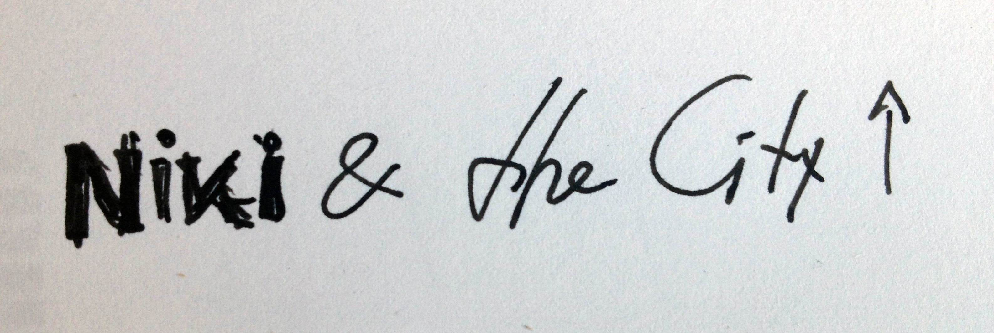
This was my first sketch, made while hearing the briefing on the phone:

Art direction
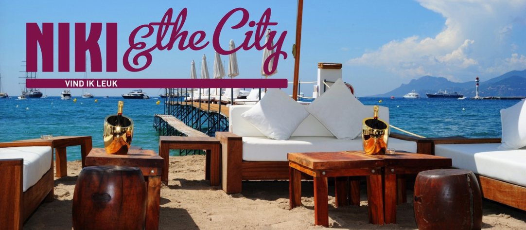
Art direction over the rest of the website; use of colours and images, is optional. In this case, NIKI will occasionally hire me to check if the website still feels solid.
Proposal
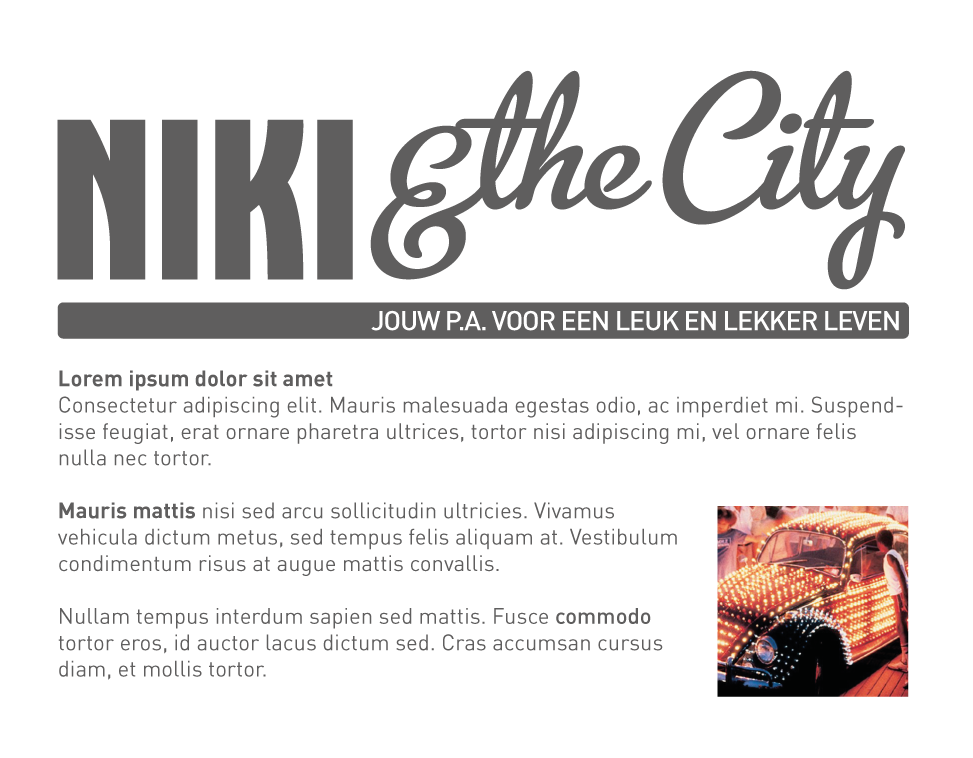
This was the first logo proposal I sent to my client, she loved it:

Client Quote:
Female but not too flimsy. That was the briefing for the new letter logo, NIKI & the City. The first propsal was spot-on, outspoken without being overly hip. Female without being flimsy. I am very happy, with the result and the super fast way of working with Mark. Including his thoughts on catchy payoffs, colours and layouts. NIKI Rap
