House style for BYA
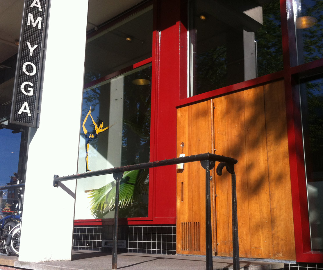
BYA asked me to design their trademark. Assignments like this automatically make me think about the entire ‘house style’. They were pleased with the logo design and asked me to think about the store exterior (the colours and lettering) and a way to blind the school’s windows without losing light.
I ended up designing the storefront, website and their printwork too. This house style was built up from lots of small elements over an extended period of time. BYAs non-design shopping elsewhere turned it into a very solid yet flexible visual identity.
All things ‘house-style’
When BYA opened a second school I helped with the interior layout, designed towels, more print work and a steel outdoor sign.
The no smoking signs on the sidewalk are consistent with the other printwork and their ‘house style’

Visual identity
Contact me if you are setting up a new business (or when you are rebranding your existing one). I can help you make your visual identity solid; from your trademark to your interior, so you can hit the ground running on day 1.
My preferred field of work is around startups and small business.
