Hand drawn logo
Hand drawn logo (and graphic website redo)

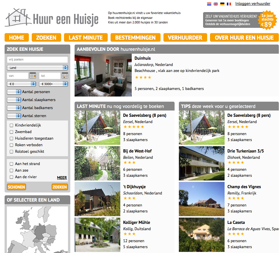
VanDeInhoud (I designed their logo and Look&Feel) asked me to help with a graphic update. For this ‘rental vacation home website’, a client of theirs:
Graphic update
It seemed to me that redoing website graphics would be pointless if they kept their old logo. The first pencil sketch I made for the new logo was considered to be spot-on. I love that. It determined much of the rest of the redo; the shades of gray combined with the stronger colour (in this case orange, the main colour changes with the seasons)
Hand drawn logo for HeH:

Live at: www.huureenhuisje.nl